Here’s the Bronze Armour Set of the Week blog post and a little something extra. I got to thinking about the Bronze sets and looked at a few sets in general and realised that some of the sets in SWTOR are just downright ugly! So I’m going to highlight an ugly set of the week as well (for comparison and because I want to).
Bronze Armour Set of the Week – The Nomad Armour Set
Back with another Bronze armour set for you to consider. This week it’s the Nomad Set. Although there are some things about this set that kinda bugs me, overall, it’s a nice looking set, especially compared to others that are well, just ugly (as we’ll see in a bit).
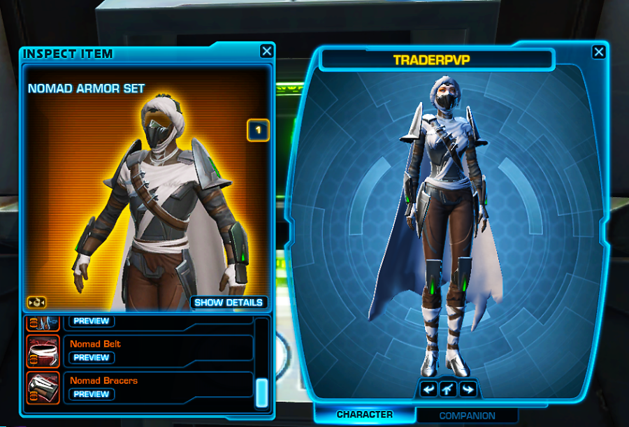
With this set, I particularly like the headpiece – there are a lot of headpieces that have a similar design where it covers the mouth and nose. Not all of them are as nice as this one. I like how it sits evenly on the face. The set looks perfectly pieced together until you get to the arms, shoulders and legs. Why would you have to mess up a set by adding chunky arm braces and knee braces with green bits that glow? The set is white/brown and grey with a mixture of metal and fabric so it’s fine that the knee braces and arm braces are metallic. But the green glowing piece does NOT fit with the rest of this set and looks silly, bringing down what would otherwise be an easy 8 out of 10 marks. The other thing that annoys me is the shoulder piece – again, green glowy bits and way too chunky. If you look at the image on the right, you can see how the shoulder pieces just look wrong and actually make the overall aesthetic of the set less appealing and less symmetric.
Aesthetics: 7/10
Symmetry: 7/10
Colour: 8/10
Overall: 7/10
Ugliest Set of the Week – The Advanced Slicer Set
My newest post idea is kind of a no-brainer. Whilst there are some really nice looking armour sets that have come out of SWTOR, there are some equally hideous sets that I think will be fun to find and talk about. First up it’s the Advanced Slicer set.
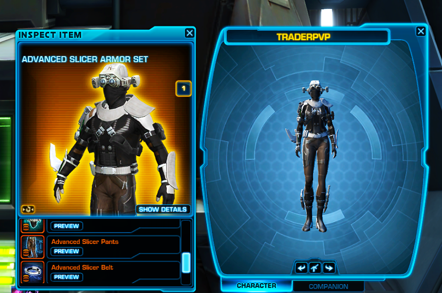
This set is bronze and it’s bronze for many reasons. Firstly, the headpiece. I cannot lie it is absolutely atrocious! I understand it is supposed to look “mechanical” in appearance because slicing machinery is kind of a mechanical type of task but two cameras/lights on either side of the head look wrong. Secondly, what is that jutting out of the right-hand arm brace? This instantly lowers the symmetry of the set by a lot making the amour look lop-sided. The neckpiece also looks chunky and again, one shoulder piece impacts the overall symmetry of this set.
I understand that this set is not designed for aesthetics (which is probably why it looks quite ugly) and is more likely designed for an actual purpose (such as traditional armour that is designed to keep you alive). All of that is great but I have seen many sets of armour and some of them specifically designed for a particular use (like this one) and they seem to look quite good.
I don’t know who is responsible for designing these armour sets (I have seen some of the concept designs on Art Station) but quite a few of them are really quite ugly.
Symmetry: 0/10
Colour: 4/10
Overall: 4/10
