That time of the week again my SWTOR fashionistas! Set for the week is the Ventilated Scalene armour set vs the Drifter armour set.
Bronze Armour Set of the Week – Ventilated Scalene Armour Set
The Ventilated Scalene armour set is a little odd but I think that’s what makes it look so unique. Much like other ventilated sets, it is designed to look like parts are missing which can allow for a lot of mix and matching of armour if you were that way inclined, of course.
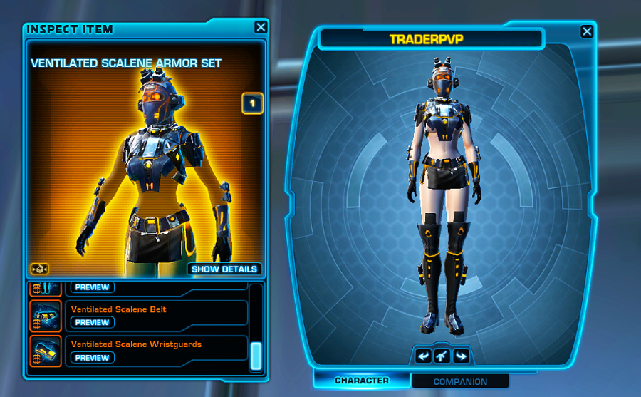
As you can see by the image on the right, lots of gaps for you to change the armour if you want. As it is, this armour set is pretty nice but I wouldn’t wear it as it is because the bareness just looks wrong to me. One of the nicest things about this armour is the colour scheme – anything grouped with black usually looks nice but the orange really stands out. The thigh-high boots are awesome. Probably the only thing detracting from a better overall mark is the headpiece which I think looks too much like other headpieces you can get with other sets.
Aesthetics: 7/10
Symmetry: 10/10
Colour: 9/10
Overall: 8/10
Ugliest Set of the Week – The Drifter Armour Set
There are a lot of reasons why this set makes it to my “Ugly” list. Firstly, it looks like someone already tried to mix up this set to match it better only they didn’t do a very good job. It looks extremely mismatched and out of place. The colours also don’t flow very well. Green and Yellow could work, but it just doesn’t here.
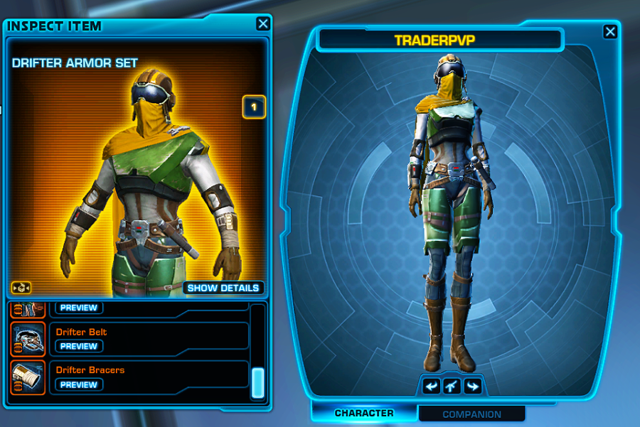
We’ve got leg pieces that look like they belong on a Trooper or a Bounty Hunter/Merc so instantly that’s a markdown. The chest piece looks almost “boxy” disrupting the symmetry of the set. The headpiece is the nicest part of this set because the colour is bold and the style with the goggles is kinda cool. But it makes the rest of the set look very mismatched. And lastly, the belt – this belt is ridiculous on this set. It looks wrong in every way and again adds to the overall mismatched look of the armour set.
Aesthetics: 3/10
Symmetry: 3/10
Colour: 6/10
Overall: 4/10

I actually like that Drifter set, and would totally have maybe a bounty hunter wear it, but you are right, it’s quite ugly. I think maybe I like that it all looks mismatched?
LikeLiked by 1 person
Hehe yeah, I got feedback on twitter from some other players who use it too 🙂 In comparison to a lot of other Bronze sets on the market, the Drifter set is not all that nice but hey, that’s my personal opinion 🙂 I do think it was purposefully supposed to look mismatched which can totally work in some armour sets 🙂
LikeLiked by 1 person