Previously I mentioned that I had started studying Graphic Design on Udemy. I’ve spent about four hours of study so far learning some new techniques in Photoshop. Some of these techniques I’ve used before and others are entirely new to me, so I am already filling in gaps in my knowledge of Photoshop which is excellent!
The examples here are my first attempts at making an actual poster so it’s a mock-up of how a potential client’s poster could look if that’s what they wanted me to design.
One of the things I’ve learned already is that as a Graphic Designer, you have to look at every possibility and provide the best of those to your clients, whoever they may be. What you like and what seems right to you means very little to the client if they want something specific. You have to put aside what you like and put yourself in your client’s shoes. They may choose a colour scheme that is totally wrong for the design, but if that’s what they want, you have to create it.
And I experienced a bit of that making these posters because straightaway I didn’t like some of the things the lecturer was doing with the text etc. but I followed along without question because I wanted to learn everything, even how to make obnoxious colours look good on a poster.
So here’s example mock-up poster number 1:
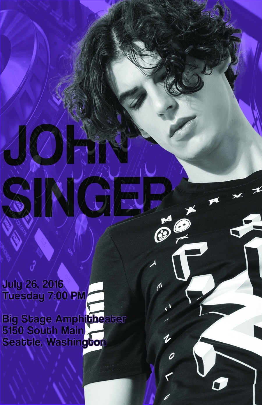
With the lettering, I decided it looked better with a stroke added to it to make it stand out more. I added that myself 😉
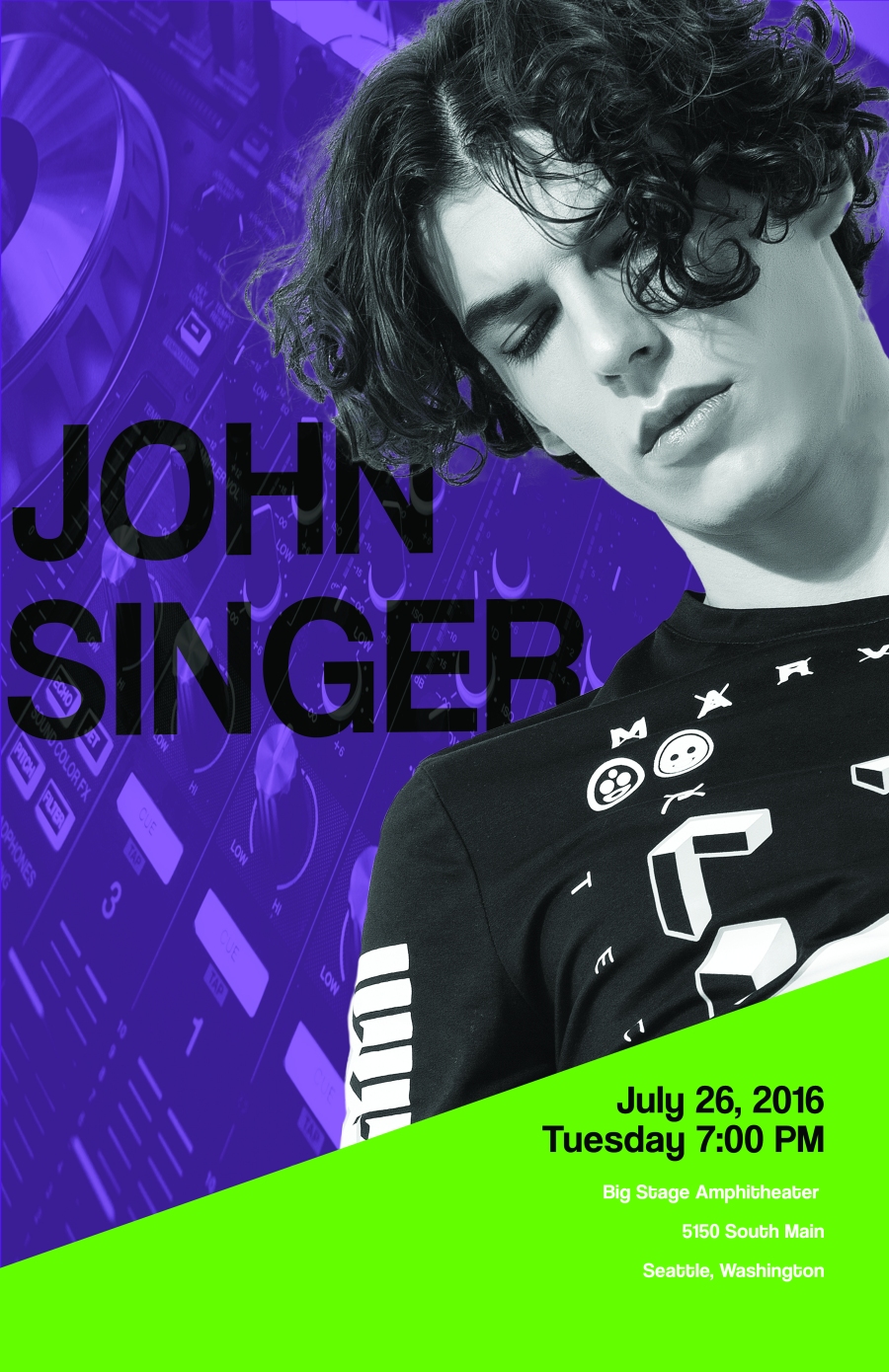
And example number 2:
The best part about all of this is that I am going to apply these techniques to making Star Wars related content for my blog and Instagram and I just can’t wait!! 😁

These look awesome! And you’re right, the text is definitely easier to read in the second one 😃
LikeLiked by 2 people
Hi Tara, thank you my friend 🙂 I got some critique from For Tyeth as well which really helps and I’m going to keep practicing the techniques on other things like Star Wars images 😀 I am so looking forward to making those 🙂
LikeLike
Hi Xen, great work here. I think you’ve used a colourised base image, multiple layers including a semi-transparent layer set to Overlay for the text (Singer’s name) and another layer with an Alpha mask to create the cut-out of John? Using the Stroke definitely makes reading the lower text easier – and you used a contrasting colour to your base image of purple which is good – draws the attention to the important details of when and where the show is taking place.
LikeLiked by 2 people
Oh wow, thank you so much for your comments! Are you a graphic designer by trade? I can still see a couple of things I missed and could improve but I think it’s pretty good for my first attempt 🙂 I can only get better! But the most important part is I am loving it and having so much fun, I don’t know why I didn’t do this earlier 🙂
LikeLiked by 1 person
Hi Xen, no I’m not a graphic designer by trade but my designing does require attention to details – plus I studied Media Studies at college where we learnt a little about iconography and ideology in marketing. I have also done a bit of photo editing in my time to create my gallery pictures. I use GIMP which is freeware/open source photo editing software and Blender 3D allows me to do Compositing of 2D and 3D imagery.
LikeLiked by 2 people
Oh wow that’s cool 😁 This is my first time actually learning outside of what I’ve taught myself so I’m really enjoying it. I think you can be equally as skilled being self taught but I think it’s much harder to prove your skillset without formal training. I tried using GIMP once, it didn’t work out very well so I moved to Photoshop and I’ve been using this ever since 😊
LikeLiked by 1 person
That’s perfectly ok, I use GIMP as I can’t afford PS but the basic techniques are the same. Blender, again is a cheaper option for me to use though I have to say a gentleman who now works for Marvel started on Blender (in fact he created the title animation of the Marvel logo with images of comic book pages flashing in the background using Blender!) You have to get your skills when and where you can!
LikeLiked by 1 person
I totally agree! I haven’t done anything art related since school tbh, but using Photoshop again and doing some animation has really opened up my creativity once more. Now I just want to learn everything I can! I am an empty glass ready to be filled with all that there is to learn 😁
LikeLiked by 1 person
That’s a great attitude, you can learn from all sorts of inspiration and media. I will keep an eye on your progress.
LikeLiked by 2 people
Thank you so much 😊
LikeLike
[…] you’re still following my little journey down the Graphic Design rabbit hole, you’ll know that I’ve recently started studying Graphic Design for beginners through a […]
LikeLiked by 1 person
This is the way the viewer is attracted to the color mode. Although some think the colors do not match, however, these colors are more reflective. I like to admit that although you knew about photoshop you learned new things when you started your studies. I say this because by seeing some of my students who, although they were too weak in design programs and creative ideas, they admitted that they could fly leaflets and brochures such as these. But really they did things with ready-to-play programs and it was very disappointing to me when I found out how lazy they were and they did not really try to learn new things but I need to get into the head with more difficulty but more difficult I had the opportunity to learn how to learn the programs, but some of them later went into the job market. Sufficient success.
LikeLiked by 2 people
Wow, thanks for the comment, much appreciated. I won’t be going into the job market any time soon. In fact, I anticipate it may be a year or more before I will be ready to submit any designs for paying customers. But thank you for insight and for the follow 🙂
LikeLiked by 1 person
Amazing design. Thanks for Share.
LikeLiked by 2 people
Oh thank you so much and you’re welcome friend 🙂
LikeLike