I posted this Star Wars edit a couple of days back but the more I looked at it, the more I thought it wasn’t good enough or somehow could be improved upon. The original image was kind of flat without the GIF I made at the top:
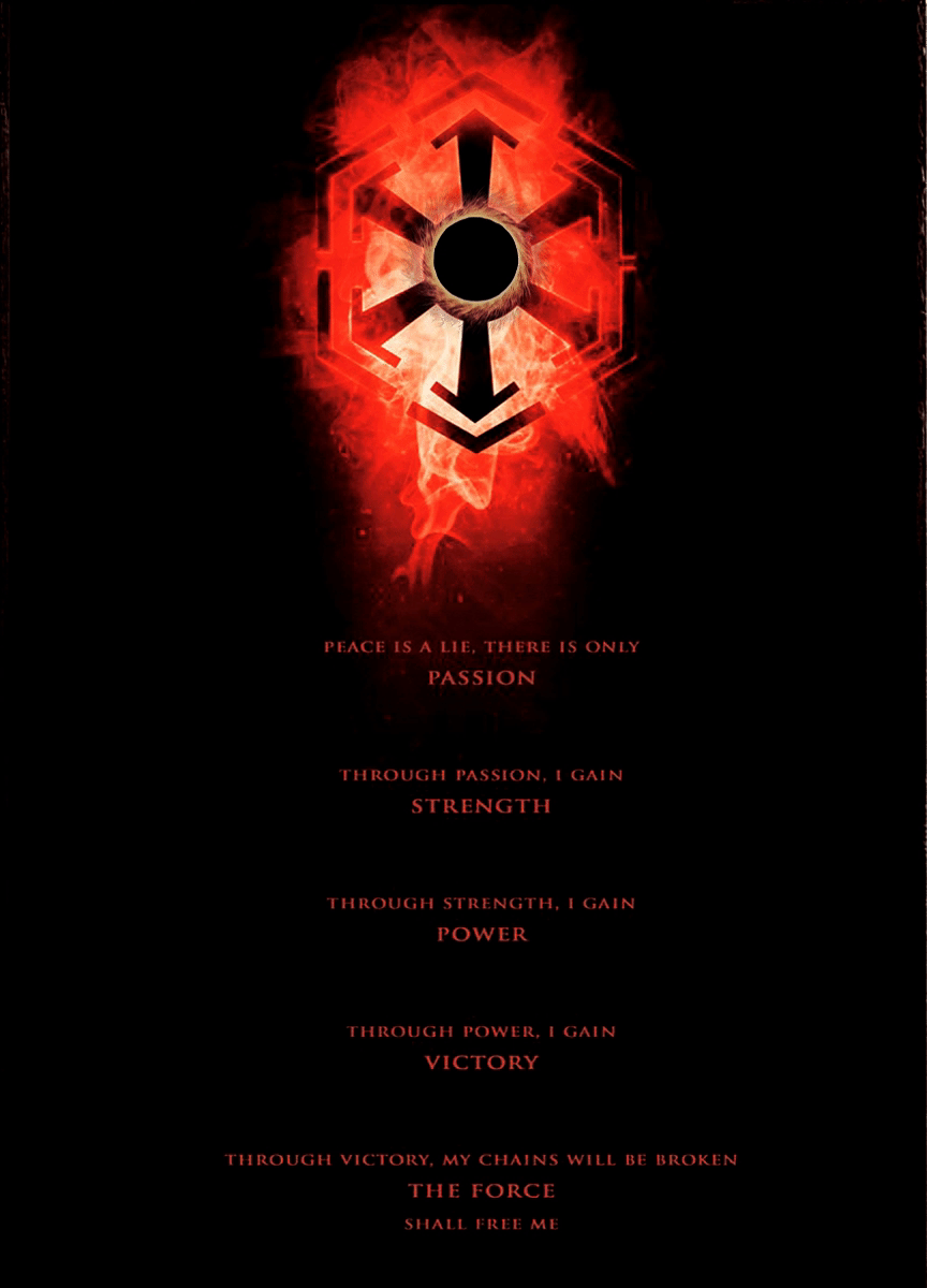
When I zoomed in on the image, I could see that the lettering was “doubling” up almost like it had been copied and added to the document in Photoshop. It just looked terrible, to be honest. So I spent some time mucking around with font designs in photoshop, and I finally came up with this:

But I’m still not sure it looks right especially after reading Typography rules about mixing fonts and moods. Also, no matter how many times I’ve tried to even up the font, everything still looks lopsided.
Back to the 🎨drawing board🎨 I think 😊. If this is what design is all about, I think it’s a good fit for my pedantic personality type. Onwards and upwards friends. Updates to come!

[…] on from where I left off yesterday with my redesign effort on this original Etsy poster, I realised as I was changing elements of the […]
LikeLike