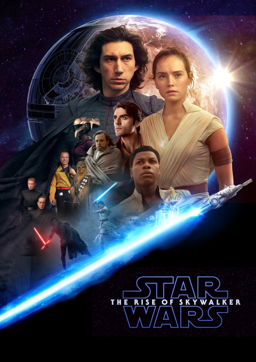
Just found this via www.milnersblog.com and it looks good and I really like it but I can see a couple of things wrong with it which I am not going to point out. Sometimes knowing about how images are masked together can give you an entirely new outlook on graphic and digital design. I also don’t like being that person that nitpicks things (you know the one), so I am gonna just post this image and say “Only FOUR months and a bit to go!!!”

Hey, thanks for sharing my poster. 🙂 I’m happy you like it, even though it’s far from perfect.
LikeLiked by 1 person
Hi there! Oh I meant no disrespect at all! I’m a noob learning myself and my stuff is bad lol! Your poster is actually one of the better ones I’ve seen. How did you get into poster design if you don’t mind me asking? I haven’t found any courses that are specifically for this area of graphic design.
LikeLike
Oh hey.. sorry, it’s been a while, but I just saw your reply and wanted to answer your question.
I’m actually working as a designer, but I try to improve myself, by seeing what other people do, watching Tutorials on Youtube and basically just playing around with Photoshop. I actually made my first Star Wars fanart poster, because someone online told me, that no fan is as good as the original poster artists and that kinda challenged me. I agree, that the old Star Wars posters by Drew Struzan are masterpieces and that his skill is waaaaaaay beyond mine. But when I look at many modern posters, I often think “I can do better than that.”. 🙂
LikeLiked by 1 person
Hi there! Oh yes I remember that post it was a while ago 🙂 And yeah, I had aspirations towards design and I love being able to create new things or take someone else’s idea and make something totally unique from it. I love that aspect of art and creativity but I am not an artist nor a designer, like you, I like to dabble. How are you finding your job as a designer? How long have you been designing if you don’t mind me asking? Sorry I am just so curious lol 🙂
LikeLike